
By Oliver Santos
If you are familiar with many of the novels that are considered classics of 19th century British literature, then you have probably heard of Ivanhoe by Sir Walter Scott. Ivanhoe is part of a larger set of books called The Waverly Novels. These novels were illustrated by a variety of artists whose drawings were packaged together in a book titled Landscape-Historical Illustrations of Scotland and the Waverly Novels. UMBC Special Collections has an edition of this book, which contains many drawings by George Cruikshank.
Most of the drawings that George Cruikshank contributed to The Waverly Novels are rendered in a style that is part caricature, part illustration, depicting funny scenes from the novels in which characters find themselves in unfortunate or awkward situations.
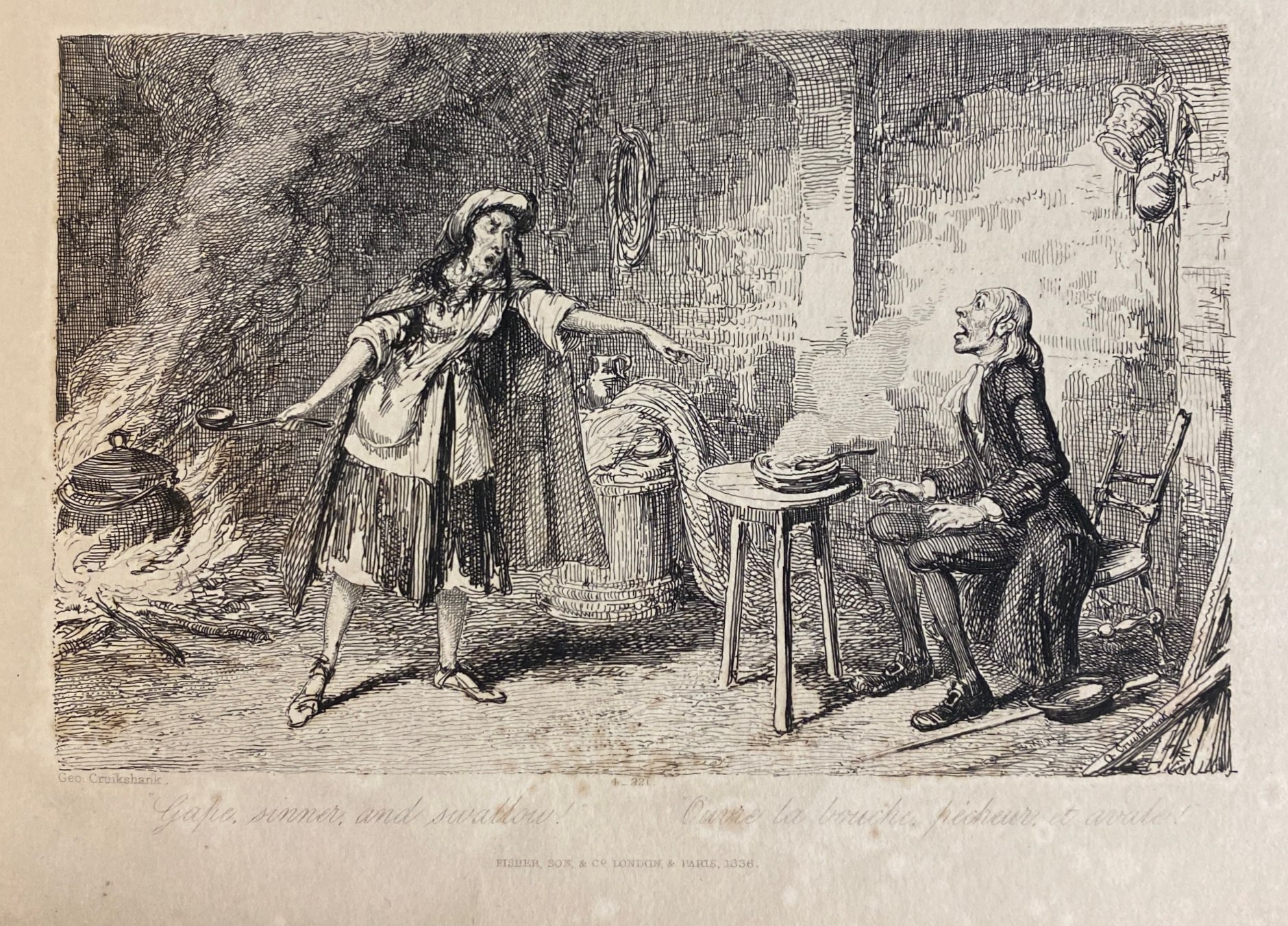
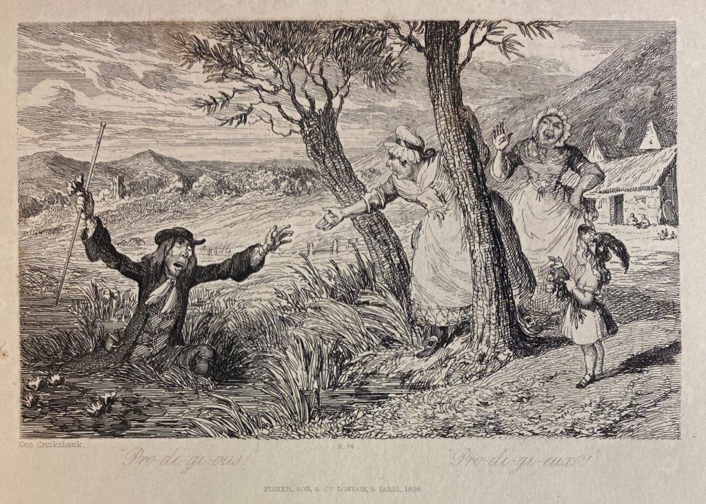
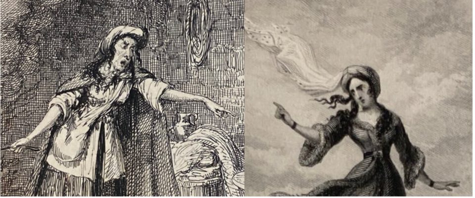
The images above, for instance, invite viewers to laugh at their subjects’ misfortune. In “Gape, sinner, and swallow,” a young man is shocked to find himself scolded by an older woman. Based on the title of the image, it seems that the young man has offended the woman in some way, prompting a sharp rebuke. In “Pro-di-gi-ous!” a man caught in a bog begs for help from two maids, one of whom laughs heartily at his trouble while a child watches.
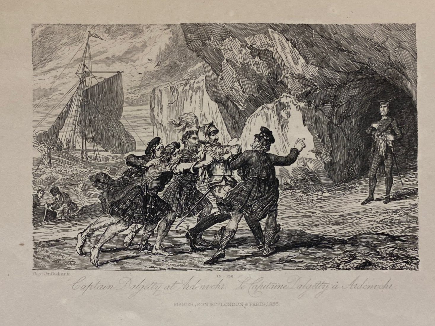
Like “Gape, sinner, and swallow” and “Pro-di-gi-ous!” “Captain Dalgetty at Ardenvohr,” which depicts a reluctant knight being dragged towards a well dressed figure in front of a cave, makes use of dramatic facial expressions and forceful looking gestures. A great deal of attention has been given to the human subjects of the piece, but the background has been drawn with slightly less detail, making it appear slightly out of focus as it would in a photograph.
The people depicted in these first three drawings do not have the extremely absurd, exaggerated facial features that are seen in other George Cruikshank engravings, but their features aren’t quite realistic either. Their eyes and noses, for instance, look slightly larger than they should be, something common with caricature portraits even today.
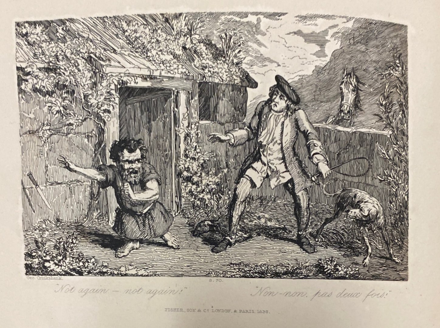
Other features are also drawn oddly, perhaps to bring attention to certain qualities. In “Gape, sinner, and swallow” the woman’s wrists and ankles appear dangerously thin, calling attention to how skinny she is. Meanwhile, in “Not again–not again!” which depicts a dwarf throwing away a knife before a man with a whip, the dwarf’s feet and toes are drawn larger to emphasize his shortness.
All but one of the engravings George Cruikshank produced for The Waverly Novels are united by their caricature-like style. The image that stands out from the others is called “One foot nearer & I plunge myself from the precipice.” It depicts a man reaching for a young woman standing on the parapet of a castle balcony.
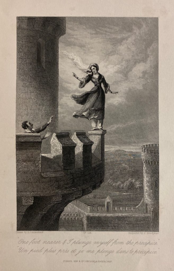
What makes this plate stand out from the others in The Waverly Novels is its highly realistic and detailed style. In this illustration, George Cruikshank has not exaggerated any of the characters’ physical features. Even the movements of the figures appear less lively and more frozen, not unlike a tableaux vivant.
The scenery in the illustration is also notable. While the background of other pieces appears to have received less attention than the human figures, that is not the case here. The castle balcony and walls are drawn with extreme detail. Cross hatching on the castle wall gives it a stony texture. The clouds in the sky show a great deal of chiaroscuro or shadow work, making the scene hyper vivid.
The differences between the illustration of the woman on the parapet and George Cruikshank’s other illustrations bring to mind the different value assigned to caricature and naturalist art. Caricature was never looked at with the same reverence as naturalist art. In The Waverly Novels, however, the works of George Cruikshank are depicted alongside works by members of the Royal Academy such as J.M.W. Turner.
Viewing the works of George Cruikshank and members of the Royal Academy side-by-side prompts one to wonder, why was caricature always seen as a lesser form of art? Furthermore, considering George Cruikshank’s ability to work in a naturalist style similar to that of artists like Turner, why did he retain his caricature and caricature-like style? Perhaps by exploring the collections here at Digital Cruikshank, you will be able to formulate your own answers to these questions.
To see more of the digitized versions of George Cruikshank’s works, visit UMBC Special Collections at https://contentdm.ad.umbc.edu/digital/collection/cruikshank.